Color is very important to create atmosphere in a room. Because color can make a room seem larger or smaller. A space can even feel warmer or colder by using the right colors. In my drawing, I want a luxurious open feel. This I will achieve by using colors in a good way and by adding the right accessories.
A few tips:
A dark color on both long walls makes your room look longer:

If you make one wall darker the room appears to be wider.

Your ceiling will look lower when you color it dark. If you have a very high ceiling than it appears to be higher!

Warm colors will make your room look smaller and cozier.

Cool colors like blue, white, mint green and lilac often give a more spatial effect:

Balanced or unexpected?
If you stick to simple rules, you can create a successful color scheme.
I show you two ways to do it:
Monochrome
To obtain a balanced result in your home it is best to choose one color and apply it in different shades on the walls but also in the accessories. We speak of monochromatic colors. This harmony we see in nature. For example in the shading of leaves and plants. These monochrome harmonies are often soothing and comfortable. In Floorplanner you can easily customize the color of your wall, as well as most accessories you find in the library.

Complementary
If you want to be more creative with your colors and accessories you can choose to use complementary colors. These are the colors facing each other in the color circle below.
Find a good balance if you use those colors. Make sure that a single color doesn’t take the upper hand. Blue for example is a calmer color than orange. In most cases you can use a lot of blue with an accent of orange to get the right balance.
For me that means I should add some yellow to my purple interior. Purple and yellow are both strong colors. I balanced 50/50 and kept the rest white and calm.


What does it mean?
The color you choose for your room will be crucial. It is responsible for the feeling and the emotions it evokes in you. I’ll show you some facts about color and interior:
Red
Red is the color of passion. It is a very strong color that can work on the mind. It symbolizes fire, aggression, intensity, ... It stimulates. The stimulatory effect of red is best for areas with lots of motion, such as the entrance of the salon. In the entrance red gives you a warm and cordial feel. It gives character to your home and you immediately create a festive feeling. Also in the kitchen red is a good choice because it activates the appetite!
Orange
Orange represents energy and cheerfulness. An euphoric effect can easily be obtained with orange tints. If you prefer a more modest feel then go for earth tones. This gives a rich color scheme with a quiet and friendly atmosphere that can make your living room very sympathetic.
Yellow
Yellow often is very dominant when used bright. In different tones yellow brings coziness into a room. It’s a warm sunny color, even when it’s used in a light tone.
Green
Green is the color of nature and of peace. It ensures freshness, confidence and calmness. Good to use in a baby room or office.
Blue
Blue shades bring peace and make you clam. It brings a serene atmosphere. That’s why many bathrooms and bedrooms painted in blue because they help to relax.
Violet
Purple rooms always have a luxurious feel. It’s the color of wealth, spirituality and relaxation. Another advantage is that purple optically magnifies spaces.
White
White is the color of purity. It "purifies" the "neutralizes" the room. White surfaces or certain shades of white can light up a room. It may also increase contrast by coloring a wall while the rest is white.
My client wants to have a luxurious feel. Purple is perfect to create that. By adding some re furnishing and a wooden floor I created a bit more coziness and passion!...In your designs please try many combinations. Surprise yourself and your customers!
Have fun!


 Many organisations use Google Apps for email, calendars and documents. Today Google launched a new service called


 We released a Swedish version of floorplanner! Now Floorplanner is available in 14 languages.
We would like to thank a couple of our Swedish users for their help in this. They helped translate about 50% of the entire platform, our web pages, the drawing tool, manuals and the objects in our library. Big thumbs up!
We released a Swedish version of floorplanner! Now Floorplanner is available in 14 languages.
We would like to thank a couple of our Swedish users for their help in this. They helped translate about 50% of the entire platform, our web pages, the drawing tool, manuals and the objects in our library. Big thumbs up!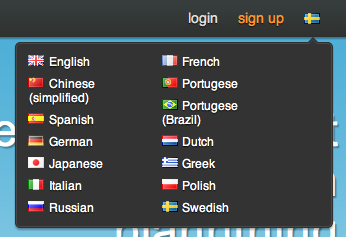


 In january we released a Czech version! We hope to bring all the floorplanner goodness to the Czech- and the Slovak republic.
Thanks to our dedicated translators!
In january we released a Czech version! We hope to bring all the floorplanner goodness to the Czech- and the Slovak republic.
Thanks to our dedicated translators!